I recently read this paper, on the measurement of onsets of clusters in EEG data from Guillaume Rousselet and later got asked to be a reviewer of the paper. The main point it raises is a different one to what I adress in the paper: Most people do not explicitly test for an onset, they fall victim to the interaction-fallacy. In principle, you need an explicit test, testing e.g. timepoint 100 vs. 150 to check whether the activity changed significantly.
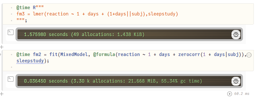
But because I recently implemented the ClusterDepth algorithm in Julia, I thought it would be nice to add this to the papers algorithms to test onsets (and I thought it should do great).
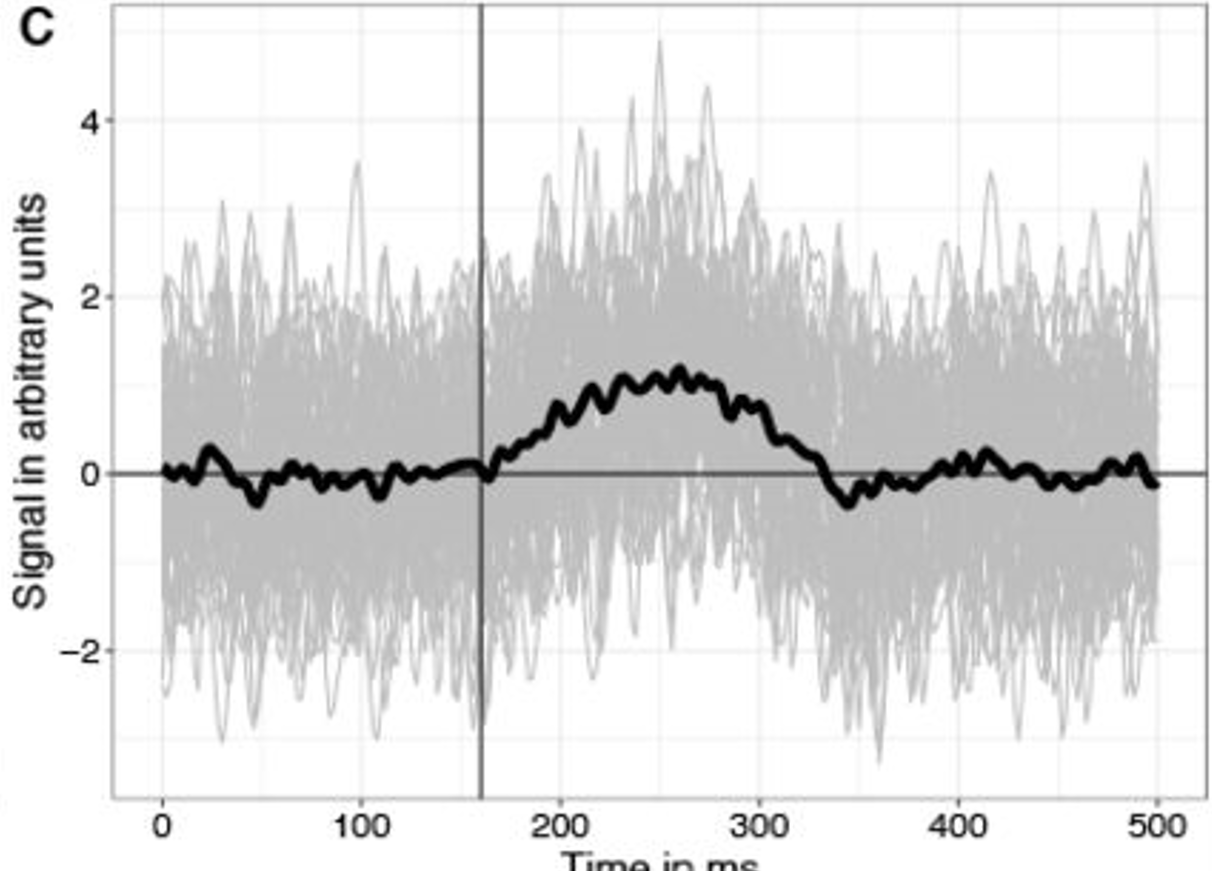
Let’s start with simulating data – I used our toolbox UnfoldSim.jl which made simulation relatively easy
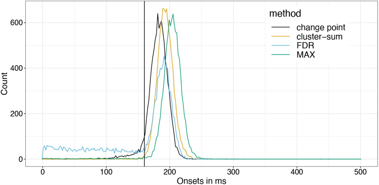
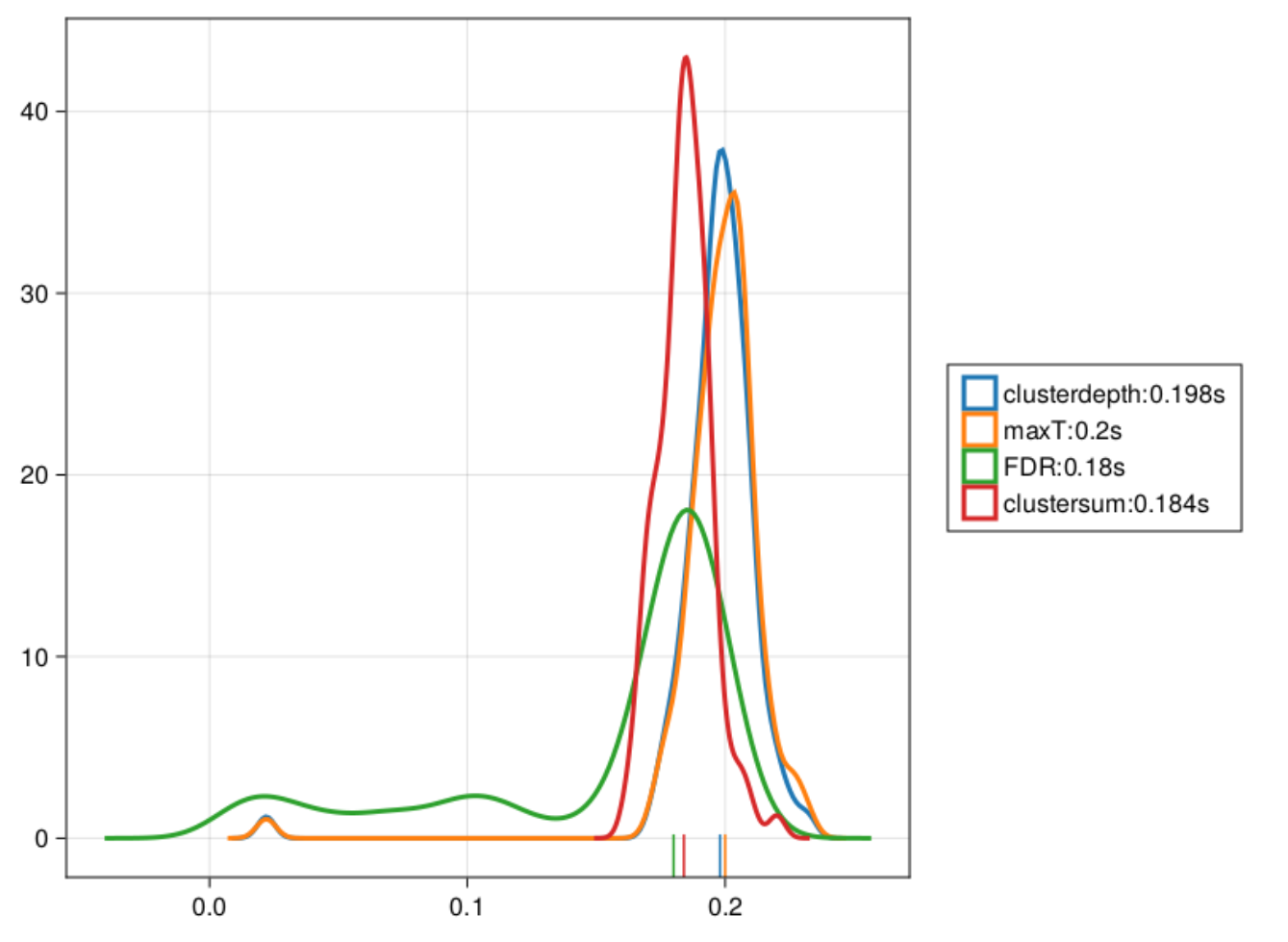
As you can see, Cluster-sum is earliest, then FDR but with many false positives in the bsaaeline, and then maxT / clusterdepth. My implementation contains clusterdepth, but I did not implement the change-point detection. I think the results very nicely replicate Rousselet 2023!
I am surprised though, that the clusterdepth did not perform better, and I’m currently investigating why this is the case.
After an innocent question of a student on how to measure occular dominance, I was let down a rabbit hole.
In a more recent paper I found it referenced as the “Dolman Method” Li et al 2010. A good starting point! Indeed, it pointed to Durand and Gould (1910) which developed an aparatus to measure occular dominance.
But this is clearly not a Hole-in-card test, also neither of those are called “Dolman”. Let’s dig deeper!
Durand and Gould 2010
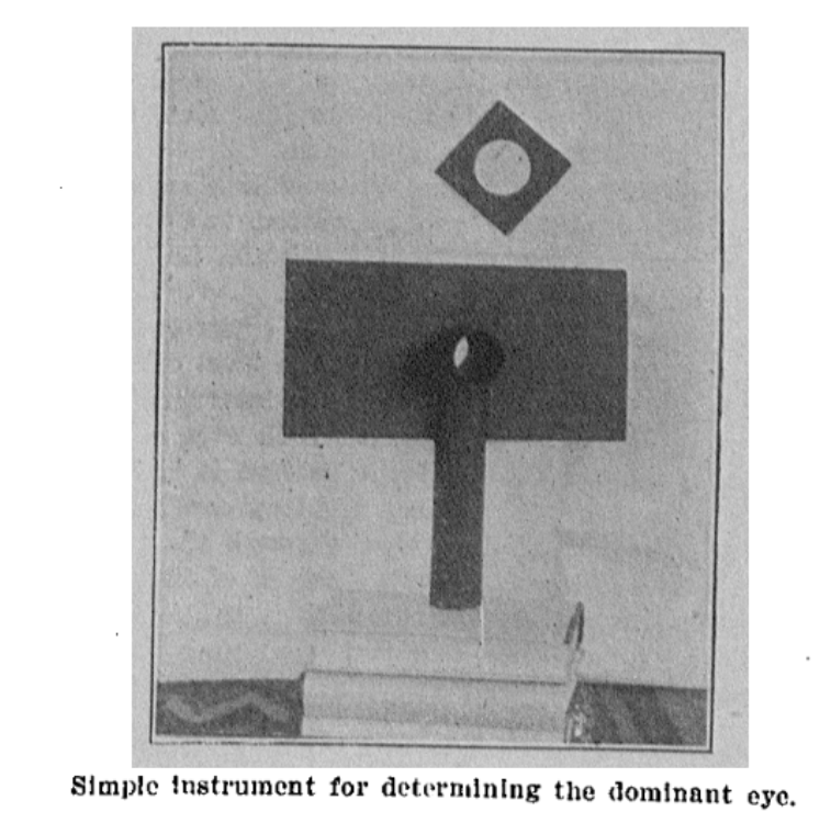
Google didn’t really help, gpt4 offered me fake citations and blamed me that I can’t find them — but google-scholar offered me Miles 1929. It is a nice read, citing some Da Vinci (via Gould s.a.), referencing Donders all in the context of binocular vision and ocular dominance. Funnily, he’s mentioning that Helmholtz didn’t reference this problem at all. And finally, it contains the original source of the Dolman Method, by Captain Perc. Dolman 1919 (“Tests for determining the sighting eye”, page 867, American Journal of Ophthalmology volume 2). I pasted the single-page paper below.
And there we have it — the de facto standard for measuring optical dominance. Interestingly, Dolman is rarely cited. So next time, you know better!
Author
Citations
Durand & Gould 1910
81
Miles 1929
251
Dolman 1919
29
Dolman is rarely cited, the hole-in-card test is typically attributed to Miles or Durand/Gould, even though both their methods used “scopes”
Dolman 1919 – first description of the actual hole-in-card test.
In repeated measures designs, we commonly repeat trials within a subject. This leaves us with a problem, though: trials from within one subject are typically more similar compared to trials across subjects. This requires us to use repeated-measures ANOVAs, Hierarchical, Multi-Level, or as in the case of this blog: Linear Mixed Models.
I commonly see analyses for within-subject designs with LMMs, that use formulas like:
y~1+condition+(1|subject)
or
y~1+condition+(1|subject) + (1|item)
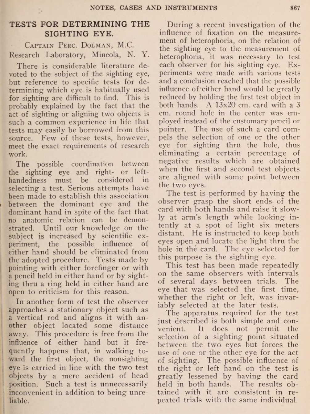
Type-1 Error of omitting condition random slopes
I ran 100 simulations without any effect. Type-1 shows how many condition p-values are below 0.05, even though there is no effect. This should be 0.05 if the model is perfectly calibrated, and below 0.05 if it is conservative. We typically don’t want this number to be larger than 5%
As can be seen in this graph, the type-1 error of omitting the random slope of subject can be huge, if such a slope is actually present in the data. The size of this type-1 error deviation depends on several things, most importantly the size of the random slope compared to the residual variability, but also the number of trials per subject, the number of subjects, residual variability and others.
The correct model to use is:
y~1+condition+(1+condition|subject)
(I think) the underlying thought is, that by using (1|subject), we allow each subject to have different values, thus the differences between subjects are accounted for. But this is too simplified. While we account for the general offset of each subject, we didn’t reach all the way – we forgot to take into account, that trials from a within-subject condition effects will be more similar to each other as well – not only the modelled Intercept-offset.
Indeed, this fallacy is addressed in many papers on LMMs, for instance in the famous “Keep it maximal” paper:
A common misconception is that crossing subjects and items in the intercept term of LMEMs is sufficient for meeting the assumption of conditional independence, and that including random slopes is strictly unnecessary […]. Indeed, some researchers have already warned against using random-intercepts-only models when random slope variation is present (e.g., Baayen, 2008; Jaeger, 2011a; Roland, 2009; Schielzeth & Forstmeier, 2009)
A different motivation might be, that this is the only model that “converges”. Typically, some kind of model simplification is performed, removing correlations, then slopes, then intercepts (but why not remove intercepts before slopes?) Anyway, this leads us a bit astray to the domains of Matuschek 2019, who argue that always sticking to the maximal model has a cost in power (e.g. from 15% to 10% in small samples, or ~45% to 40% in middle sized samples; model-simplification vs. maximal model, Figure 1+2); while at the same time, they argue, the type-1 hit in that test region is small. Importantly, they never argue to start with the 1+(1|subject) model! While in some proportion of the simulations (up to 80% for very small datasets, Figure 3), this model is ultimately selected, they argue: “Our simulations showed that, in the long run, the parsimonious model yields the best chances to detect a true fixed effect as significant.” – but this includes their model-simplification procedure.
Intuition: Why is slope more important than intercept (to control type-1 of condition)?
One superficial way to think about this issue, is to think about the difference of (1|subj) and (1+c|subj): The former is a design where you record multiple trials from each subject, but for each subject only in one condition (condition between subject). In the latter, you record multiple trials from both conditions (within subject). It just seems intuitive to me, that these two very different designs, should be reflected by different models.
For the second way, we need an example: Let’s say, we recently invented the HairStretchShampootm, but we don’t know if it actually works. Thus, we invite 100 subjects, each 20 times, and measure their hair length. Each time, they either applied the HairStretchShampootm – or not. Our analysis model is:
The following components account for the following things (assuming effect coding):
$\beta_{int}$ fixed intercept effect: 40cm. Accounts for the average hair length over all subjects.
$\beta_{shamp}$ fixed shampoo effect: 1cm. Accounts for the average Shampoo-effect (this is what you want to know + it’s uncertainty).
$\theta_{int}$ random intercept effect: SD = 20. Accounts for variation between subjects on their hair length, this will likely be rather large. It tells you, that the average hair length varies considerably around the fixed effect of 40cm.
$\theta_{slope}$ random shampoo effect: SD = 2. How different does the shampoo work for different subjects? With an average fixed effect of 1cm, this SD tells you the shampoo works for some, but probably not all subjects.
Note: In the list above we are not interpreting uncertainties, that is Standard Errors, t- or p-values, but rather the actual estimated model components.
If one would drop the $\theta_{slope}$ and model only the random intercept, what effectively happens is that one assumes the HairStretchShampootm-effect is identical for all subjects – even though in our example above, we “know” it varies considerable (SD=2, around a small effect of 1cm). Further, such a model assumes that the repeated measures of condition (remember, 20 repeated measurements per subject) are actually coming from independent subjects and thus contain independent information
larger number of trials => larger degrees of freedom => smaller standard errors
Sidetrack: Don’t random intercepts explain more variance? What you typically would notice, and is true in our example above, is that the Intercept fixed+random part explains much more variability in our data than the condition effect. The condition effects live “on-top” of that variability. Explaining variability in our data is generally a good thing. If we explain more variability, our uncertainty is reduced (smaller residuals => smaller SEs => smaller p-values). Thus, we should definitely care about including intercepts. But they do not make our repeated condition measurements independent.
Special cases and observations
If you only have one trial per condition-level, there is no way to differentiate the random slope variability from the residual variability. In that case, leaving the random slope does not lead to higher type-1 errors. In other words, if you average within subject your conditions first, then the random-intercept-only model (1|sub) is fine.
The (0+c|sub) performs pretty well. Indeed, Barr et al. also benchmark it and come to the same conclusion. I haven’t seen it in another paper, but they recommend dropping the intercept before the slope. That was new to me. Thus, the “ideal” way for model simplification as I see it now, is to: first drop correlation, then intercepts, then slopes of interests (except if any of those parameters is of interest). A PCA on the Random Effects (rePCA in Julia), might help identify what exactly is best to drop.
It was very surprising to me how little the presence of random-intercept mattered, if one is only interested in condition effect. This plays together with 2)
The whole thing generalizes to (1|sub)+(1|item) designs, as in Barr et al 2013 (seriously, go read that paper!)
I want to conclude with another quote from Barr et al:
This goes to show that, for such designs, crossing of random by-subject and by-item intercepts alone is clearly not enough to ensure proper generalization of experimental treatment effects (a misconception that is unfortunately rather common at present)
We invite you to participate in our ~15-30 min ERP visualization tool survey. Our results will be freely available, thereby, we hope to improve the M/EEG visualization ecosystem.
I am currently setting up a lecture on multiple comparison correction (for related posts see here or here). In a nutshell: If you apply a statistical test, that allows for 5% of false-positives (a ‘wrong’ significant finding), many many times, you are more or less guaranteed to find a significant effect (because p(at_least_one_positive) = $1 – (1-0.05)^{100} = 0.994 = 99.4$%)
False-Discovery-Rate (FDR) is one way, to try to adapt to this. In this post I will give you a visual intuition behind it, not walk you through the math.
Note that FDR has a different goal to e.g. Bonferroni correction: An FDR corrected set of p-values tries to give you e.g. 5% of false-positives, of all significant ones. Not 5% false-positives of all p-values. Thus in some sense it is a less stringent correction.
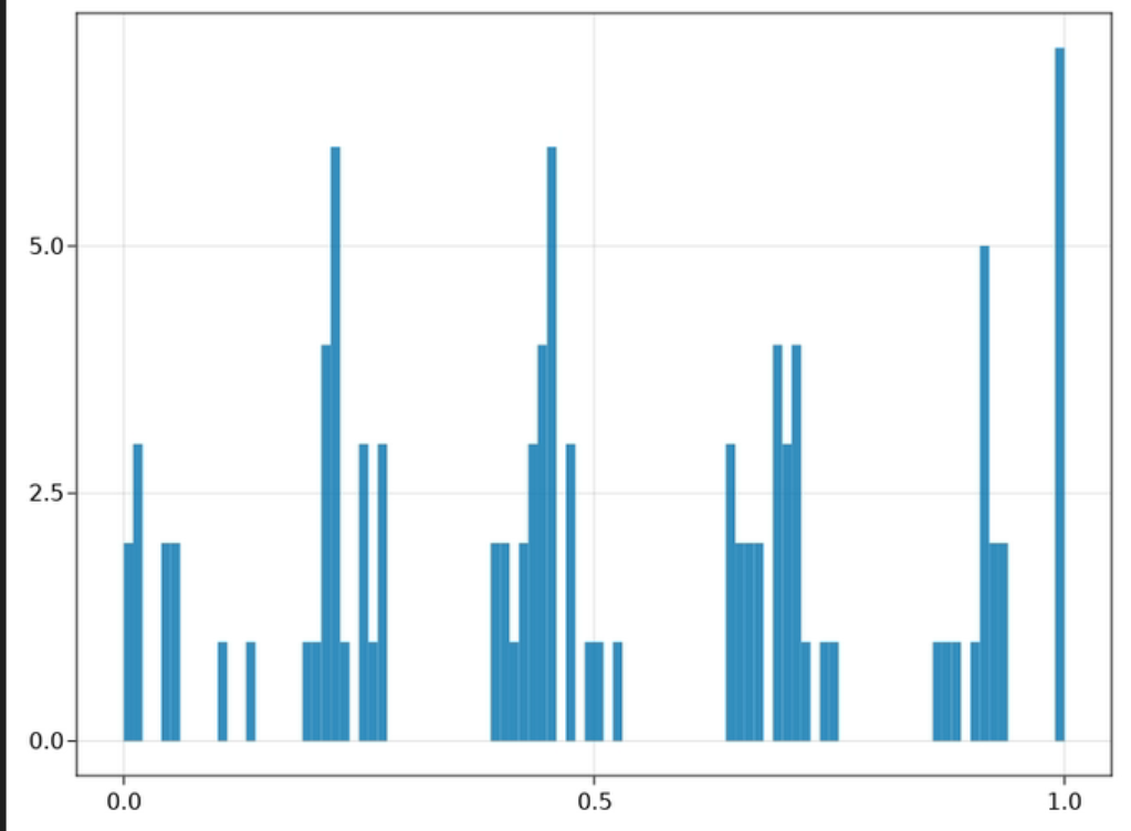
Small ex-course: p-value distributions
Imagine you simulate 1000 data-sets without any effect in them, and ran 1000 statistical tests. We take all the p-values and visualize them using a histogram, this will look like this:
each update of the gif is one instance of an simulation. Note how all p-values are equally likely. The colors have no meaning
You can see, that all p-values are uniformly distributed (which means, all p-values are equally probable) if no effect exists.
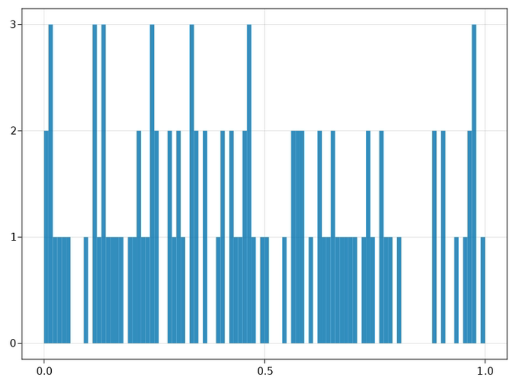
What happens now, if we introduce an effect? We would expect many more p-values smaller 0.05, but still some that are greater 0.05, just due to chance (and depending on your noise/power).
P-Values given a strong effect. Note the strong bias towards small p-values. This make sense because given we simulated an effect, it should be unlikely under the $H_0$
This is exactly what we see here.
Let’s get back to FDR
Next, what happens if we mix the two? I.e. we get some false and some true positives. This is exactly the situation we set out with! We want to control the number of false-positives where some might underly a true effect and others are member of the H0-Team. What we do in FDR is:
Estimate how many p-values could be attributed to the $H_0$ distribution. This is where the orange p-value set comes into play: Those arguably give us a $H_1$-uncontaminated calibration-set to estimate what the “height” of the uniform $H_0$ p-value distribution should be. In other words: we find out, how many p-values we expect to be smaller than our threshold ($\alpha$) if no effect exists.
Estimate how many p-values could be attributed to the $H_1$ distribution. These are the ones over and beyond what we would expect under the “pure” $H_1$
We allow for a certain amount (usually 5%) of $H_0$-pvalues relative to the $H_1$-pvalues. Because $H_1$ pvalues are expected on the smaller side, we can simply change the threshold until the ratio of these two fits.
The estimated False-Positives are the ratio of the estimated $H_1$-pvalues divided by the estimated $H_0$-pvalues. The orange line is here estimated by p-values>0.5. Note how we need to reduce our $\alpha$-threshold from typical 0.05 to until ~0.003 to reach 5% false-positives in our set of significant p-values.
This is not how FDR is calculated in practice. For this, have a look at this blog-post from Matthew Brett. But at least it allowed me to visualize it in a way I could better intuit.
Note: This blog is just explaining the basis sets, not how to actually fit models / get parameters etc.
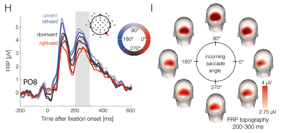
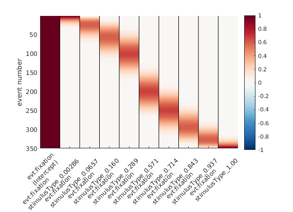
Recently, we used the unfoldtoolbox (Matlab or Julia; access it from python!) to analyze some fixation-related ERPs. The approach we used (multiple regression with deconvolution) allowed us to include this circular-predictor: absolute saccade-angle.
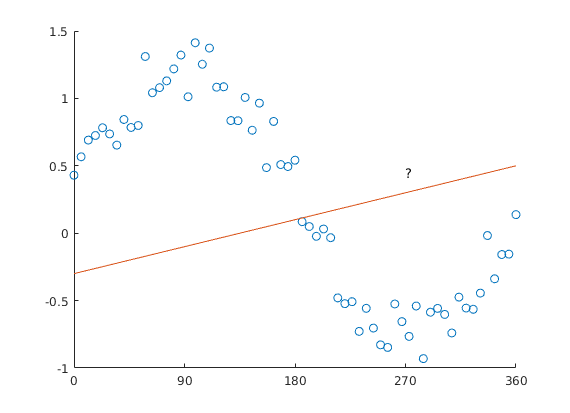
Why can’t we model saccade-angle using a linear predictor? The issue is straightforward: Look at this plot.
Predicting circular data with a straight line is difficult.
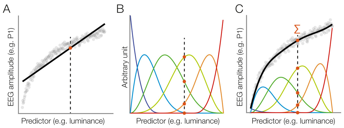
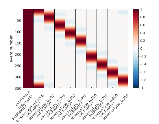
Ok, why can’t we use a standard non-linear spline regression?
Wait – what even is a standard non-linear spline regression? Great that you asked. Instead of fitting a straight line with parameters slope & intercept (think y = m*x + c), we can split up the x-axis regressor in multiple “local” regressors.
Taken from Ehinger & Dimigen 2019
But: The angle starts at x=0, and goes to x=360 – but we all know, x=0 and x=360 are actually identical! The orange line added to the plot would have 0 & 360 at different values, except for a slope of 0.
How do we fix this, how do we “wrap around” the predictor axis?
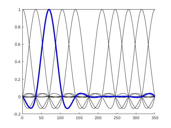
Circular Splines!
We use a basis function that wraps around 0 / 360°
Instead of having basis functions that have bounds at 0 / 360°, we are using a basis function set that wraps the circular space. If the idea didn’t become clear, here is an alternative visualization:
“default” splines, spanning 0 to 1 or 0 to 360°
Circular splines – spanning 0 – 1 in a circular fashion. Note the first spline (second column) that is “active” both at 0 and at 1 (aka 0° and 360°).
Hopefully, these visualizations help some of you to understand circular splines better!
Disclaimer: Thanks to Judith Schepers for discussing this with me; sorry for the typos etc. I am a bit in a rush
I wrote about Threshold-Free-Cluster-Enhancement (TFCE) before, this time I stumbled upon a weirdly looking H0 diagram. Let me explain: If you simulate data without any effect, you expect that the P(data|H0) distribution is uniform, that is, all p-values are equally likely. Here, I define the p-value as the minimal p-value over time that I get from one whole simulation (1000 permutations per simulated dataset) – I simulated only cluster in time not space (find the notebook here, raw-jl here). When I did this for 100 repetitions, each applying permutation TFCE and calculating the min-p, I got the following histogram of 100 p-values:
TFCE H0 distribution with integration step of 0.4
That does not look uniform at all! What is going on? It turns out, that you can get this kind of “clustering” if your integration step-size is too large. Indeed, I change the integration step from 0.4 to 0.1
TFCE H0 distribution with integration step 0.1
Now it looks much more uniform; I should probably use more repetitions (indeed in full simulations I use 10x as many) – but this already took 500s and I am not prepared to wait longer 😉
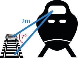
You are in a train and would like to know the speed of the train – but no phone, GPS or speedometer – here is how you do it.
Person pondering how fast she is going – https://tenor.com/JuRb.gif
Here is how to do it:
Stretch out both arms, thumbs up.
Make eye-movements from one thumb to the other, focus on the eye movements going in direction of the train
Slowly increase/decrease the distance of the thumbs, effectively changing (in a controlled manner) how large your eye movements are.
Notice the rail sleepers of the nearby track – at some point of (3) your eye-velocity will perfectly match the angular speed of the train, and you will be able to see the rails crisp as day – during an eye movement (take that saccadic suppression! – but seriously, check out that Wikipedia article, it explains step 3 in more words)
Now measure (somehow) how many thumbs-width’ your two thumbs hands are apart and take this times two (1 thumb-width are approximately 2° visual angle). For our example, let’s say we measured 7°.
Gauge the distance to the neighboring track, let’s say 2m.
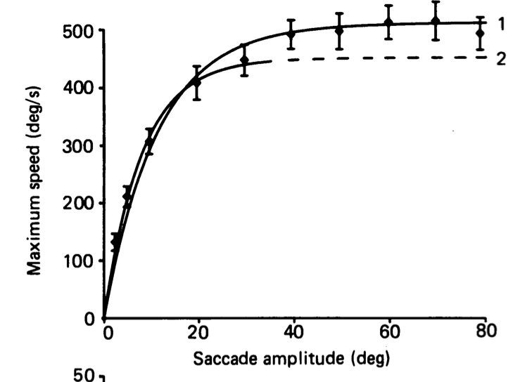
7. The final ingredient is the log-log relationship between eye-movement size & eye-movement speed: the Main Sequence of Eye movements. A 7° saccade is ~130° / s fast.
Collewijn et al., 1988
8. Let’s solve for the train’s speed: $ v=\frac{130°/s}{2*\pi} *2m=20\frac{m}{s} = 72\frac{km}{h} $
Now remember or print out the main sequence from Collewijn & you will never not know how fast the train is going 🙂
Purkinjes Blue Arc is a cool and not well known visual effect. It consists of illusionary blue arcs, emanating from a (typically) red stimulus. It has been rediscovered at least half a dozen times in the last 200 years and goes back to Purkinje. The exact physiological reason for the Blue Arcs is still not now. A detailed write-up of the demonstration with more tipps can be found in Moreland 1967.
Modern screen technology make it much easier for you, to experience this effect. Just follow these simple instructions!
Purkinjes Blue Arc Recipe
Display me in fullscreen on an OLED screen in a dark.room! Look at the red dot with the right eye only.
You need an OLED screen – ~50% of modern mobile phone screens are OLED. To check, go to a dark room and open a complete black image. Is the display pitch black (OLED), or is there backlight coming through (LCD)?
Display this gif in fullscreen – you probably need to download it. No other UI-elements should be visible
Go to a reasonable dark room
Close the left eye and stare at the red dot
Purkinjes Blue Arcs should appear
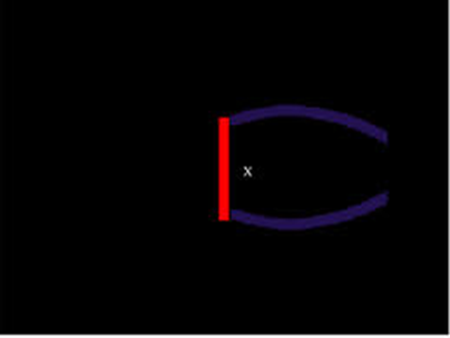
It is hard to see the blue arcs if you do not know what to look for, therefore I added a small visualization
A rough approximation of the Purkinje Blue Arcs
I can’t see it?!
Maybe you flipped your phone (or closed the wrong eye ;)) – be sure that the straight line points to the right
Maybe the room is still too bright. Also be sure that the red-color of the stimulus doesnt brighten up the background of the room
I don’t have an OLED screen: The demonstration should also work with just a red dot – maybe you have one at your stereo? Any bright red LED should work, the effect is smaller but still there. Your mileage on an LCD screen will vary…
What’s going on?
The nerve fibers from the photoreceptors are bundled and leave the retina through the optic discs. These nervebundles are called the Raphe. As visible in the next screen, Purkinjes Blue Arc follow the raphe perfect.y
The Raphe – all pointing towards the optical disc (Blind Spot)
Why exactly such a red bright stimulus activates the blue ganglio cells is currently not know.