No evidence for periodicity in reaction time histograms
Introduction
In my last lab we discussed findings on the periodicity of reaction times (e.g. referred in Van Rullen 2003). These studies are usually old (Starting with Harter 1968, Pöppel 1968), with small N and not many trials. There was also a extensive discussion in the Max-Planck Journal “Naturwissenschaften” in the 90s (mostly in German, e.g. Vorberg & Schwarz 1987). A methodological critique is from Vorberg & Schwarz 1987. More discussion in Gregson (Gregson, Vorberg, Schwarz 1988). A new method to analyse periodicity is proposed by Jokeit 1990.
This is the newest research I could find on this topic.
Analysing a large corpus of RT-data
I stumbled upon a large reaction time dataset (816 subjects, á 3370 trials, 2.3 million RTs) from the English Lexicon Project (Balota et al 2007) and decided to look for these oscillations in reaction times .
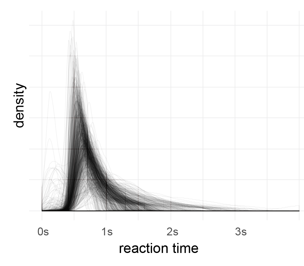
After outlier correction (3*mad rule, see below), I applied a fourier-transformation on the histogram (1ms bins, accuracy of RT=1ms). Then I looked for peaks in the spectrum which are consistent over subjects.
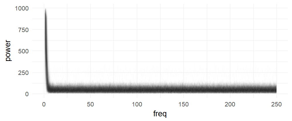
Each subject is one line, no effect is visible here (in a log-scaled y-axis also no effect can be seen). The range (above ~7Hz) of the subject variance is roughly between +0 and 100
The following graph summarizes the above graph (blue-smoother-curve = loess, span=0.1, each dot = mean over 800 subjects)):
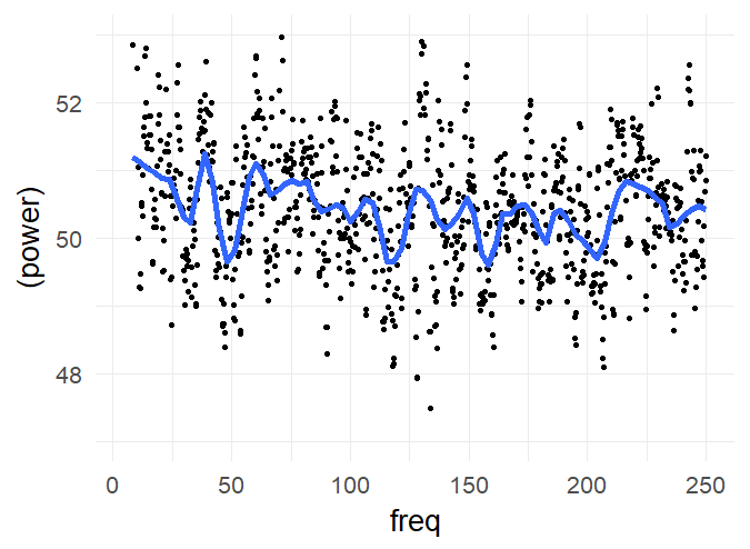
There are no peaks in the spectrum which I consider as consistent over subjects. I included higher frequencies (up to 250Hz) to get a visual estimate of the noise level (at such high frequencies, an effect seems utterly implausible). But of course, I’m ignoring within subject information (i.e. a mixed model of some sort could be appropriate).
Conclusions
In this large dataset, I cannot find periodicities of reaction time.
Disclaimer
My approach may be too naive. I’m looking for more powerful ways to analyse these data. If you have an idea please leave a comment! I’m also not suggesting that the effects e.g. in Pöppels data are not real. Maybe there is a mistake in my analysis, I don’t know the data by heart, it might depend on the task employed …
Thoughts
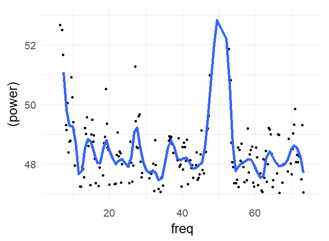
I had results like in Jokeit 1990 (but with 50Hz not with 100Hz), when I was using a bin-width of 5ms to 10ms bins. The peak (in the figure with 6ms bins => 150hz) shifted depending on bin-size. I’m not perfectly sure, but I think it has to do with how integers are binned. In any case, if the effect is real and not an artefact of bin-width, it has to show up also with higher bin-sizes. Please note that Jokeit 1990 used a different methodology, he calculated the FFT on the histogram of reaction time **differences**.
I tried to use density estimates, but so far failed to get better results.
Outlier plot
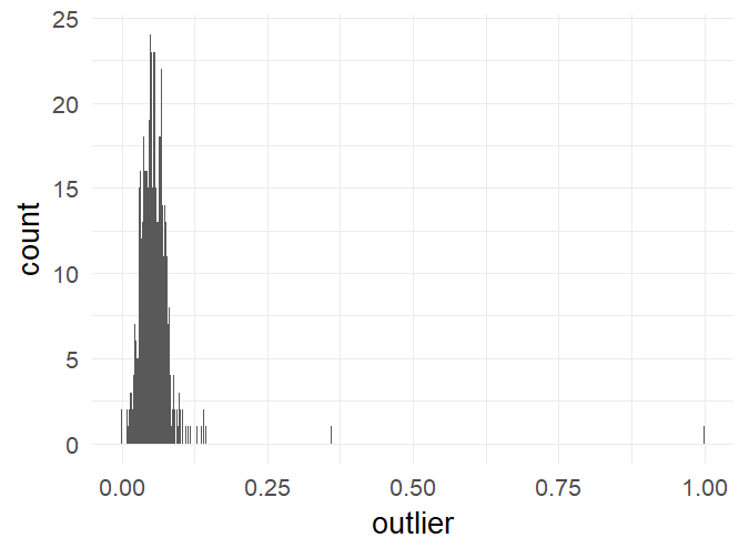
Percentage of trials marked as outliers. This is well in the recommended range of 10% (Ratcliff).
References
Bolota, D.A., Yap, M.J., Cortese, M.J., Hutchison, K.A., Kessler, B., Loftis, B., Neely, J.H., Nelson, D.L., Simpson, G.B., & Treiman, R. (2007). The English Lexicon Project. Behavior Research Methods, 39, 445-459. – http://elexicon.wustl.edu/about.asp
library(ggplot2)
library(dplyr)
theme_set(theme_minimal(20))
d = rbind(read.table('C:\\Users\\behinger\\cloud\\PhD\\exercises\\reactiontimes\\elexicon_1to100.csv',header=T),
      read.table('C:\\Users\\behinger\\cloud\\PhD\\exercises\\reactiontimes\\elexicon_101to200.csv',header=T),
      read.table('C:\\Users\\behinger\\cloud\\PhD\\exercises\\reactiontimes\\elexicon_201to300.csv',header=T),
      read.table('C:\\Users\\behinger\\cloud\\PhD\\exercises\\reactiontimes\\elexicon_301to400.csv',header=T),
      read.table('C:\\Users\\behinger\\cloud\\PhD\\exercises\\reactiontimes\\elexicon_401to500.csv',header=T),
      read.table('C:\\Users\\behinger\\cloud\\PhD\\exercises\\reactiontimes\\elexicon_501to600.csv',header=T),
      read.table('C:\\Users\\behinger\\cloud\\PhD\\exercises\\reactiontimes\\elexicon_601to700.csv',header=T),
      read.table('C:\\Users\\behinger\\cloud\\PhD\\exercises\\reactiontimes\\elexicon_701toend.csv',header=T))

d$Sub_ID = factor(d$Sub_ID)
d$D_RT = as.integer(d$D_RT)

# 3*mad outlier correction
d = d%>%group_by(Sub_ID)%>%mutate(outlier = abs(D_RT-median(D_RT))>3*mad(D_RT,na.rm = T))
d$outlier[d$D_RT<1] = TRUE
d$outlier[is.na(d$D_RT)] = TRUE

# outlier plot
ggplot(d%>%group_by(Sub_ID)%>%summarise(outlier=mean(outlier)),aes(x=outlier))+geom_histogram(binwidth = 0.001)


fft_on_hist = function (inp){
  maxT = 4
  minT = 0
  fs = 1000


  h = hist(inp$D_RT,breaks = 1000*seq(minT,maxT,1/fs),plot = F)
  h = h$counts;

  # I tried to use density estimates instead of histograms, but it was difficult
  #h = density(inp$D_RT,from = minT,to=4000,n=4000)
  #h = h$y
  f = fft(h)
  f = abs(f[seq(1,length(f)/2)])

  return(data.frame(power = f, freq = seq(0,fs/2-1/maxT,1/maxT)))
}


d_power = d%>%subset(outlier==F)%>%group_by(Sub_ID)%>%do(fft_on_hist(.))

ggplot(d_power,aes(x=freq,y=(power),group=Sub_ID))+geom_path(alpha=0.01)
ggplot(d_power,aes(x=freq,y=log10(power)))+geom_path(alpha=0.01)

ggplot(d_power%>%group_by(freq)%>%summarise(power=mean(power)),aes(x=freq,y=(power)))+geom_point()+stat_smooth(method='loess',span=0.1,se=F,size=2)+xlim(c(10,250))+ ylim(c(47,53))