Scatterplots, regression lines and the first principal component
I made some graphs that show the relation between X1~X2 (X2 predicts X1), X2~X1 (X1 predicts X2) and the first principal component (direction with highest variance, also called total least squares).
The line you fit with a principal component is not the same line as in a regression (either predicting X2 by X1 [X2~X1] or X1 by X2 [X1~X2]. This is quite well known (see references below).
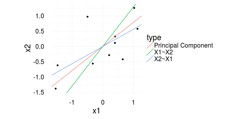
With regression one predicts X2 based on X1 (X2~X1 in R-Formula writing) or vice versa. With principal component (or total least squares) one tries to quantify the relation between the two. To completely understand the difference, image what quantity is reduced in the three cases.
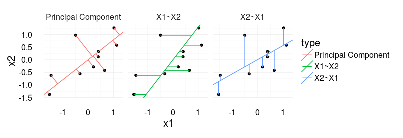
In regression, we reduce the residuals in direction of the dependent variable. With principal components, we find the line, that has the smallest error orthogonal to the regression line. See the following image for a visual illustration.
For me it becomes interesting if you plot a scatter plot of two independent variables, i.e. you would usually report the correlation coefficient. The ‘correct’ line accompaniyng the correlation coefficient would be the principal component (‘correct’ as it is also agnostic to the order of the signals).
Further information:
How to draw the line, eLife 2013
Gelman, Hill – Data Analysis using Regression, p.58
Also check out the nice blogpost from Martin Johnsson doing practically the same thing but three years earlier 😉
Source
“`R
library(ggplot2)
library(magrittr)
library(plyr)
set.seed(2)
corrCoef = 0.5 # sample from a multivariate normal, 10 datapoints
dat = MASS::mvrnorm(10,c(0,0),Sigma = matrix(c(1,corrCoef,2,corrCoef),2,2))
dat[,1] = dat[,1] – mean(dat[,1]) # it makes life easier for the princomp
dat[,2] = dat[,2] – mean(dat[,2])
dat = data.frame(x1 = dat[,1],x2 = dat[,2])
# Calculate the first principle component
# see http://stats.stackexchange.com/questions/13152/how-to-perform-orthogonal-regression-total-least-squares-via-pca
v = dat%>%prcomp%$%rotation
x1x2cor = bCor = v[2,1]/v[1,1]
x1tox2 = coef(lm(x1~x2,dat))
x2tox1 = coef(lm(x2~x1,dat))
slopeData =data.frame(slope = c(x1x2cor,1/x1tox2[2],x2tox1[2]),type=c(‘Principal Component’,’X1~X2′,’X2~X1′))
# We want this to draw the neat orthogonal lines.
pointOnLine = function(inp){
# y = a*x + c (c=0)
# yOrth = -(1/a)*x + d
# yOrth = b*x + d
x0 = inp[1]
y0 = inp[2]
a = x1x2cor
b = -(1/a)
c = 0
d = y0 – b*x0
x = (d-c)/(a-b)
y = -(1/a)*x+d
return(c(x,y))
}
points = apply(dat,1,FUN=pointOnLine)
segmeData = rbind(data.frame(x=dat[,1],y=dat[,2],xend=points[1,],yend=points[2,],type = ‘Principal Component’),
data.frame(x=dat[,1],y=dat[,2],yend=dat[,1]*x2tox1[2],xend=dat[,1],type=’X2~X1′),
data.frame(x=dat[,1],y=dat[,2],yend=dat[,2],xend=dat[,2]*x1tox2[2],type=’X1~X2′))
ggplot(aes(x1,x2),data=dat)+geom_point()+
geom_abline( data=slopeData,aes(slope = slope,intercept=0,color=type))+
theme_minimal(20)+coord_equal()
ggplot(aes(x1,x2),data=dat)+geom_point()+
geom_abline( data=slopeData,aes(slope = slope,intercept=0,color=type))+
geom_segment(data=segmeData,aes(x=x,y=y,xend=xend,yend=yend,color=type))+facet_grid(.~type)+coord_equal()+theme_minimal(20)
“`
[…] for instance, https://benediktehinger.de/blog/sci…sion-lines-and-the-first-principal-component/ FactChecker, Aug 1, 2018 at 3:24 […]
[…] See, for instance, https://benediktehinger.de/blog/sci…sion-lines-and-the-first-principal-component/ 2) In MATLAB, use [COEFF,SCORE] = princomp(X). The first row of COEFF will give you the first […]